The brand’s typographic system pairs Skribblugh and Avenir—two distinctly contrasting typefaces that reflect the creative process itself: from unfiltered ideation to refined execution. Together, they form a visual dialogue between raw expression and structured clarity.

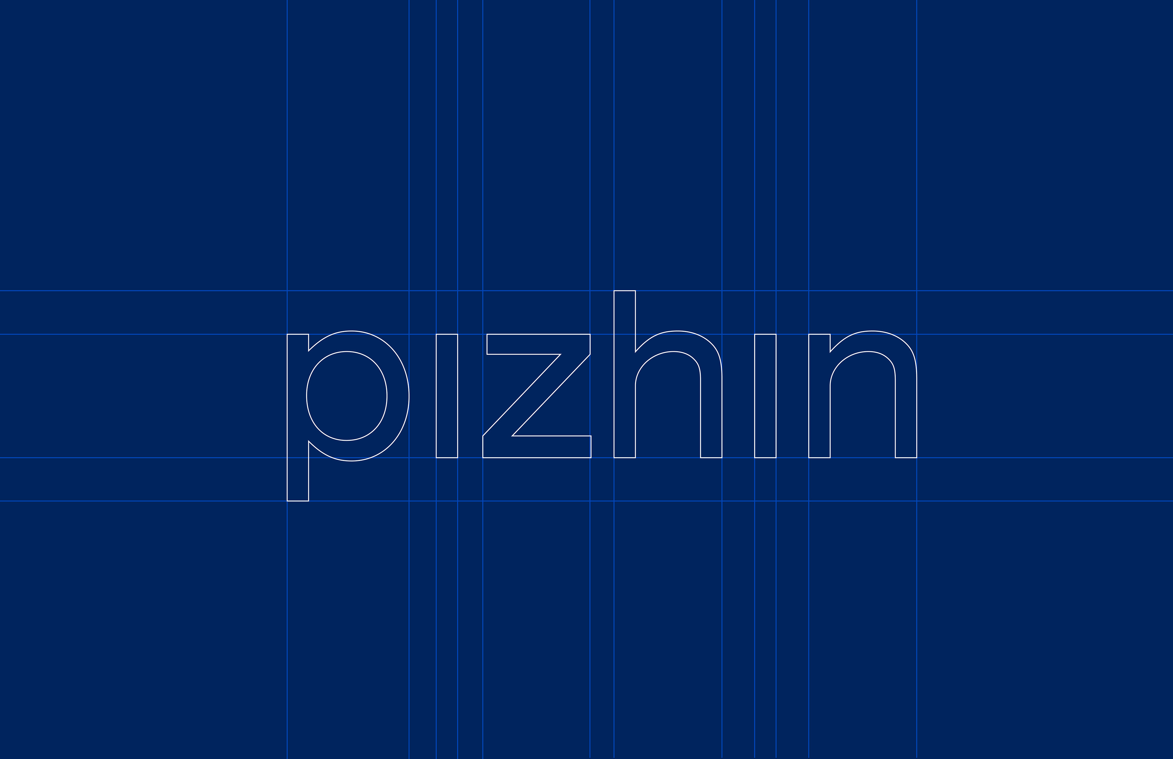
This modified Avenir wordmark removes the dots over the “i”s to represent creative lenses and a new way of seeing. These lenses reappear across the brand as symbols of transformation and perspective.

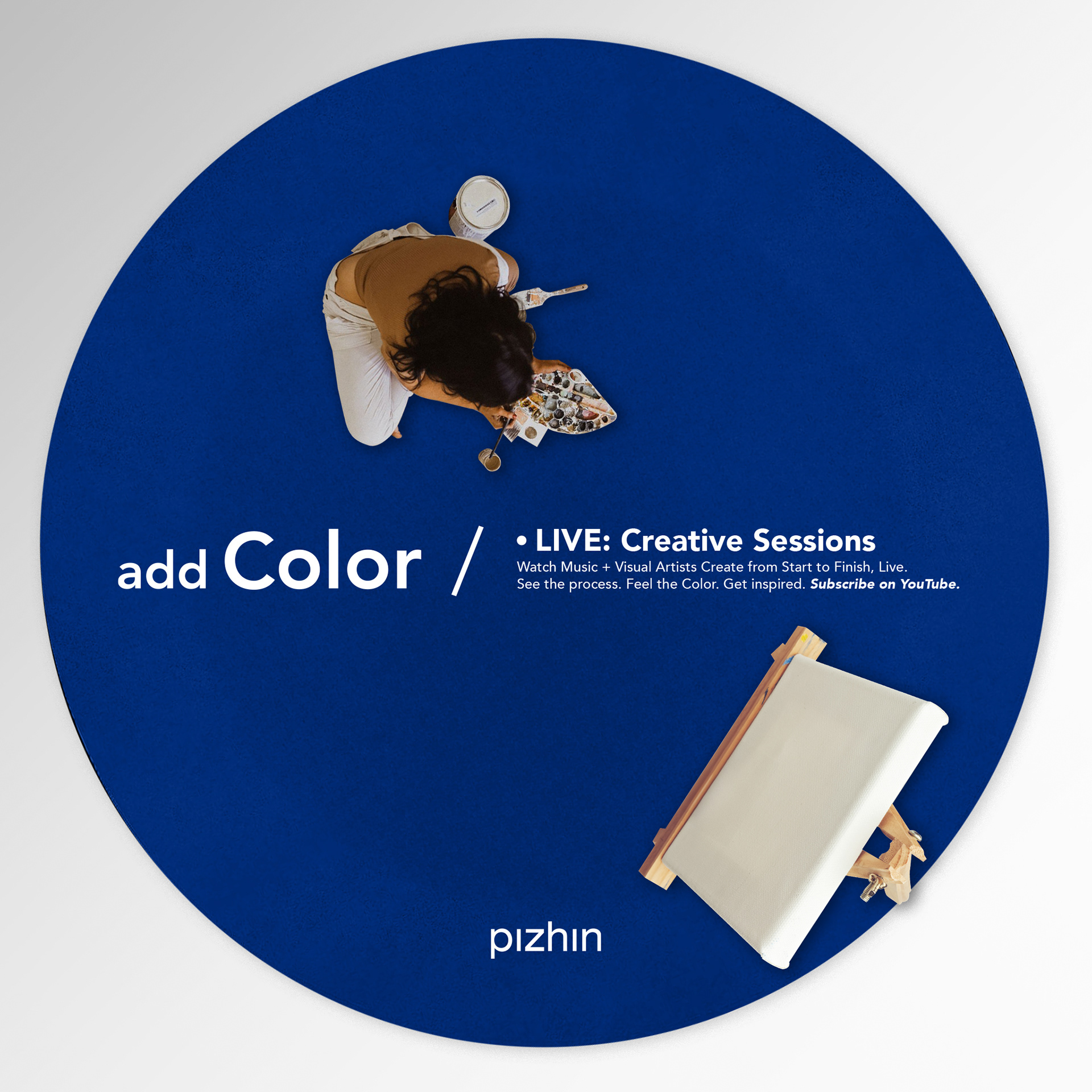
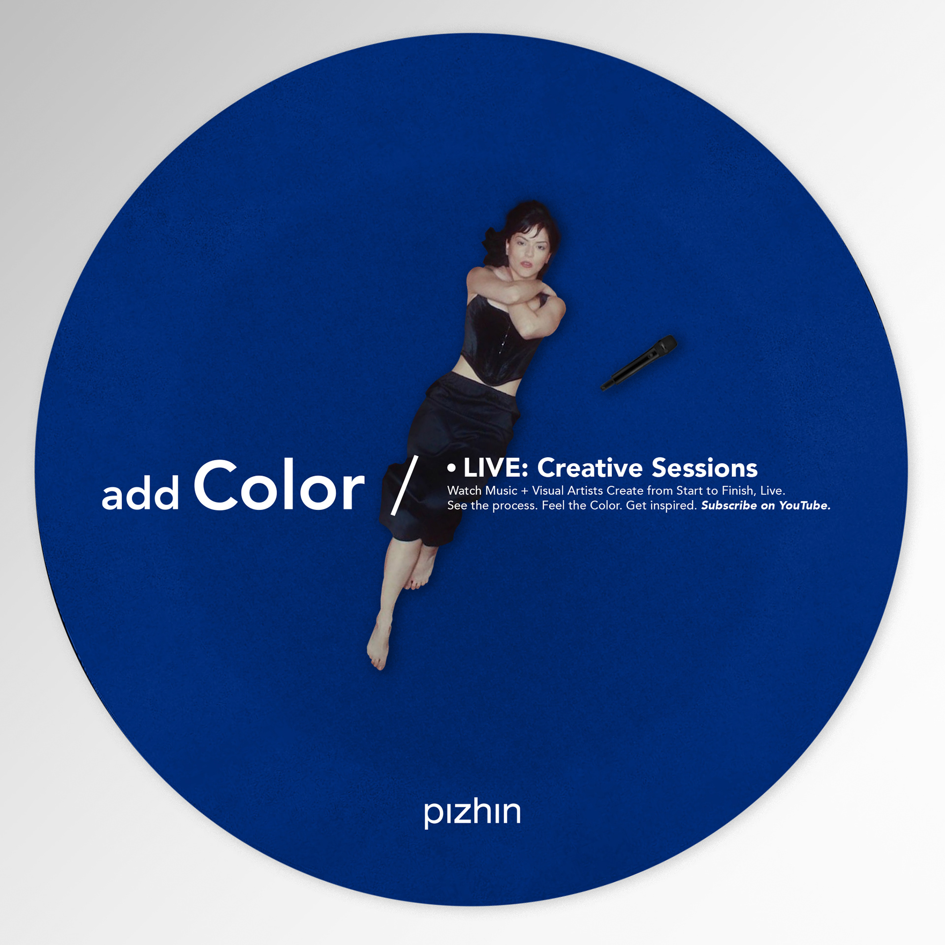
Live Creative Sessions is a social series designed to spotlight the creative process in real time. Developed as a visual template for Pizhin’s YouTube channel, the format embodies the brand’s ethos—from mind to reality—inviting artists to create within Pizhin’s signature blue lens. It serves as both a platform and a canvas for diverse creative expression.


As part of the Add Color campaign, this magazine ad was designed as an open canvas—not for promotion, but for participation. Rather than pushing pizhin's print services, it invites creative expression. Viewers are encouraged to draw directly on the page and scan the QR code to bring their design to life on a Pizhin T-shirt.
Concept
The name “Pizhin” is rooted in the Chinese word pízhí (cortex), the brain’s creative center. The suffix
“-n” implies movement and action. Together, the name reflects the brand’s mission: to transform ideas into reality.
The name “Pizhin” is rooted in the Chinese word pízhí (cortex), the brain’s creative center. The suffix
“-n” implies movement and action. Together, the name reflects the brand’s mission: to transform ideas into reality.
The brand identity is guided by a single principle:
From mind to reality.
Every design decision was shaped by restraint—minimalism not for aesthetic’s sake, but to make space for others to be seen. Pizhin is not the hero—it’s the tool.
Every design decision was shaped by restraint—minimalism not for aesthetic’s sake, but to make space for others to be seen. Pizhin is not the hero—it’s the tool.
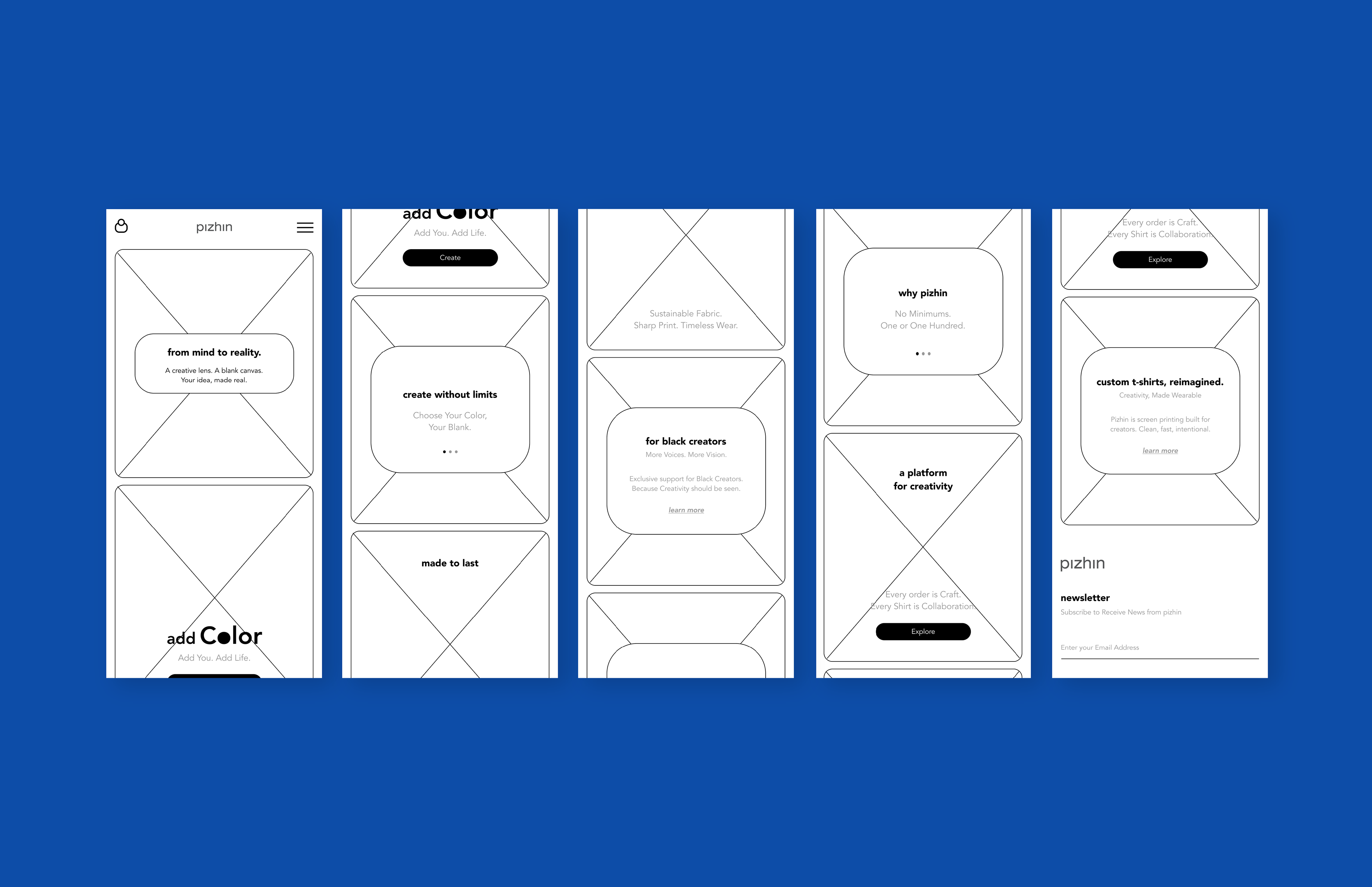
Brand Launch Campaign: “Add Color”
To introduce Pizhin, I developed the “Add Color” campaign—a concept built to answer why Pizhin exists. The campaign title is a double entendre: a call for visual expression and a challenge to personal creativity.
To introduce Pizhin, I developed the “Add Color” campaign—a concept built to answer why Pizhin exists. The campaign title is a double entendre: a call for visual expression and a challenge to personal creativity.
Campaign Elements
Add Color Commercial Concept: A bold 15-second spot stripped down to the essentials.
First 12 seconds: pure white screen—an intentional pause that mirrors a blank canvas.
Final 3 seconds: the message “Add Color with Pizhin” appears in black text—deliberate, understated, and powerful. The silence and simplicity were crafted to stand apart from the clutter of traditional ads, reflecting the brand’s ethos of purposeful minimalism.
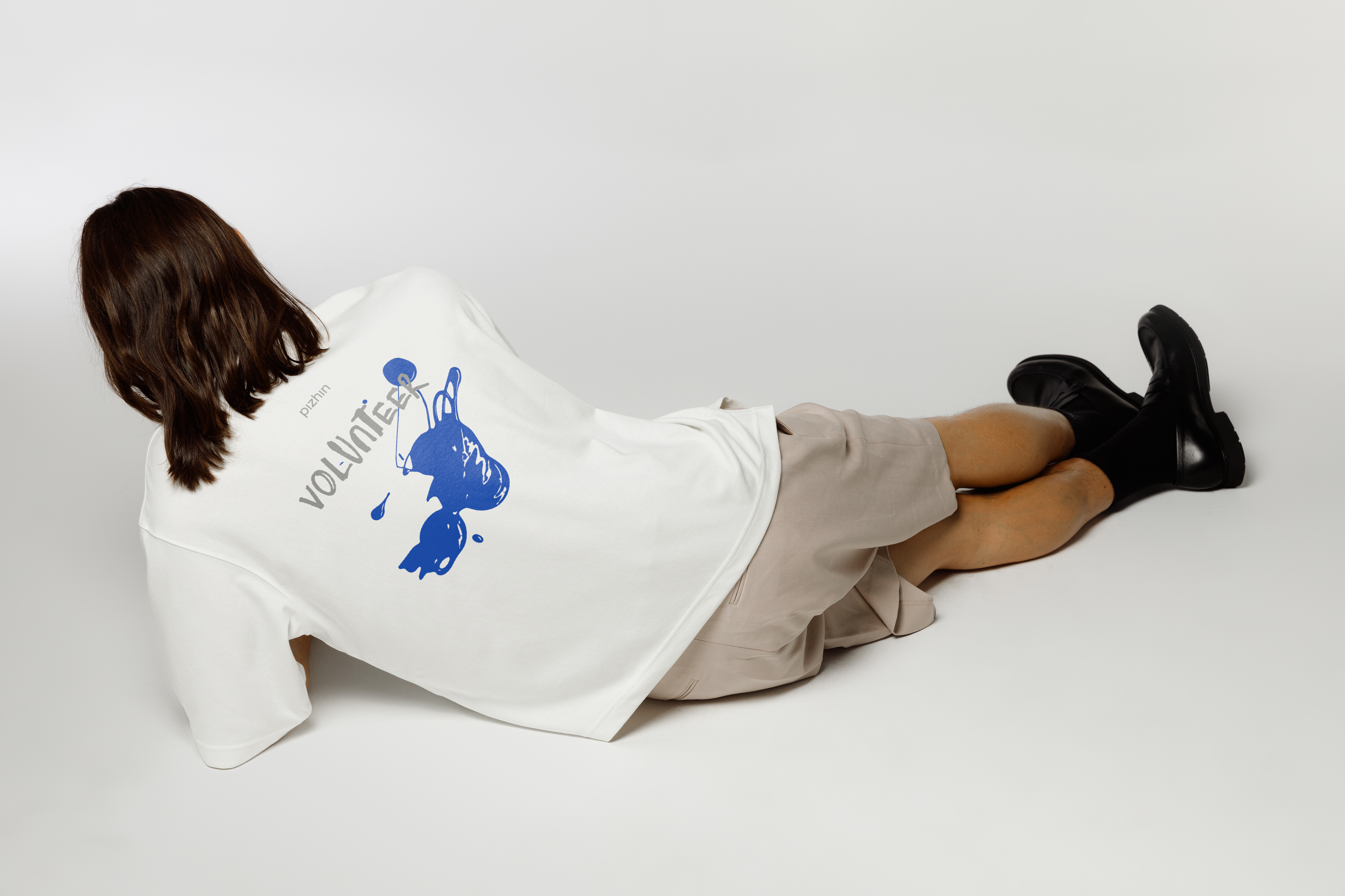
Photography: Shot entirely in black and white, each image features individuals wearing plain T-shirts against white backdrops. The only element in color: the design printed on the shirt.
This visual metaphor makes it clear—Pizhin doesn’t define you; it reveals you.
This visual metaphor makes it clear—Pizhin doesn’t define you; it reveals you.
Background
My journey in screen printing revealed a common trend—print shops becoming loud, self-indulgent streetwear brands. With Pizhin, I set out to challenge that norm. Rather than competing for attention, the brand was designed to disappear—serving as a creative utility, not a centerpiece.
Results
Pizhin launched as a new model in screen printing—one that doesn't shout, but supports. It’s a system, a canvas, and a catalyst for creativity. The “Add Color” campaign set the tone for a brand grounded in purpose, not trend—built not to be seen, but to help others be seen.