
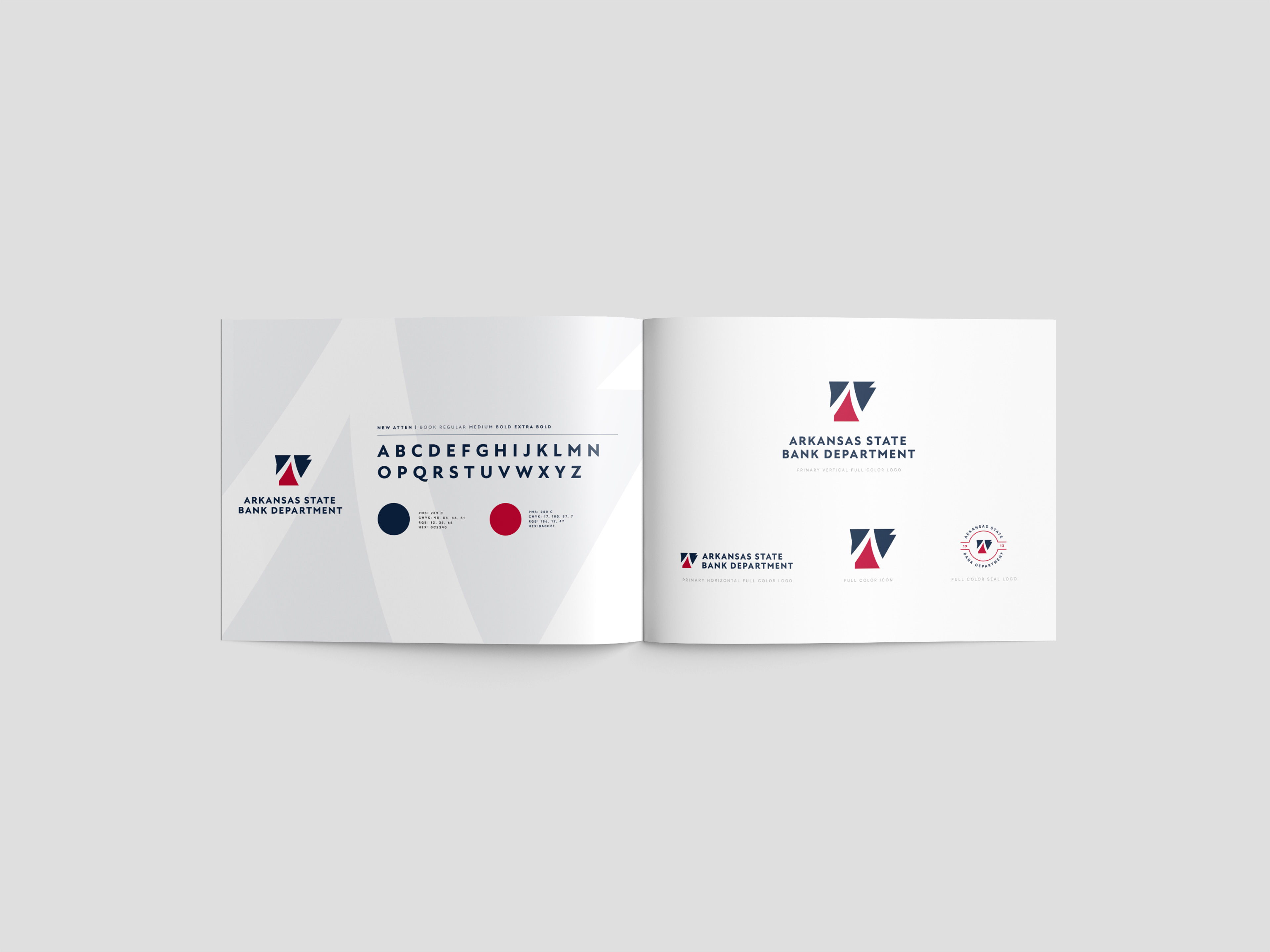
The Arkansas State Bank Department serves as the regulatory authority overseeing all state-chartered banking institutions in Arkansas. The identity redesign builds on elements from the original mark, preserving its recognizability while elevating its presence. Two legacy stripes have been reinterpreted to form an abstract “A” within the shape of Arkansas—positioning the department at the apex of the state’s financial structure and reinforcing its role as a trusted leader in regulation and oversight.


Approach
Rather than reinventing the wheel, I approached this project as an enhancement. The original logo contained two stripes—abstract and detached. I saw an opportunity to use these two elements to form something more meaningful: the letter "A" for Arkansas, hidden in the negative space. This simple shift not only brought intentionality to the mark but also grounded the logo in place-based symbolism.
Design Notes:
Color System: I adopted and slightly modified the red, white, and blue palette of the Arkansas state flag—honoring the state identity while giving the logo a more corporate, clean appearance.
Typography: Paired a contemporary serif with a no-nonsense sans serif to reinforce professionalism and clarity.
Iconography: The new emblem can stand alone or lock up with the wordmark, making it flexible across signage, stationery, and digital applications.
Execution
The updated identity was rolled out across multiple touchpoints including:
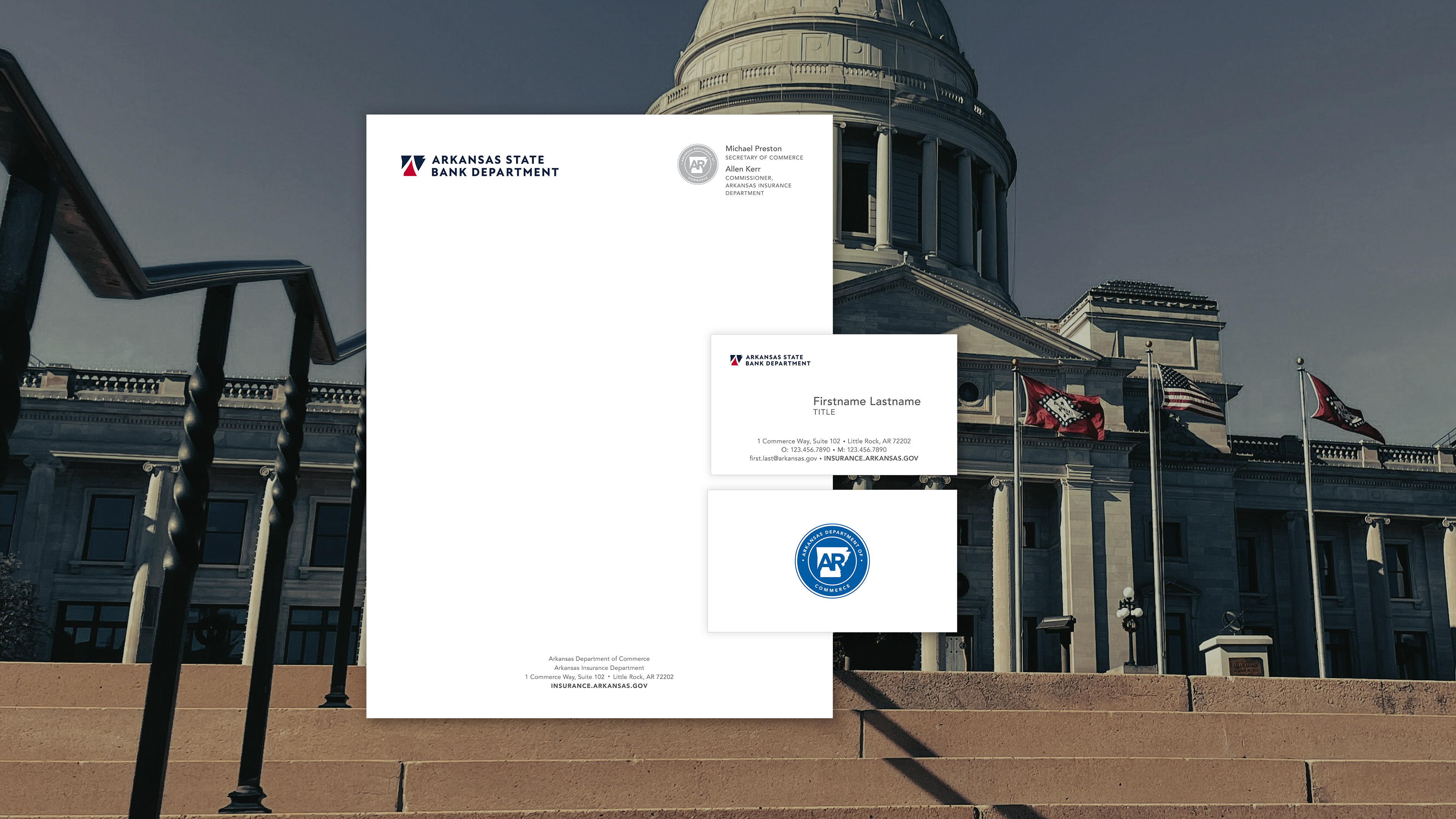
Stationery & Office Signage, Branded Merchandise (pens, pins, etc.), Updated Website & UX, Department Divisional System Integration, and Brand Guidelines & Typography System
Challenge
ASBD’s original logo used two abstract stripes and lacked a modern identity system. The department sought a refreshed visual presence that would uphold the trust, integrity, and authority of a state financial regulator while also being more recognizable and in line with state-wide branding efforts. The client specifically requested the use of Arkansas state flag colors and a modernization of their existing mark.
Results
The new logo elevated the department's visual presence while maintaining familiarity and institutional trust. By leveraging negative space and thoughtful symbolism, the identity now reflects both Arkansas pride and regulatory precision—positioning the department as a modern steward of the state’s banking integrity.